Page 1 of 2
Dashboard and Dashlets usage?
Posted: Tue Jul 07, 2015 4:05 pm
by emartine
Now that I am done migrating away from our old Nagios server I am looking into creating dashboards for folks. Are there any examples out there of some nice Dashboards that have been created? Instructions on using some of the dashlets and their dependencies?
I am not talking about this either.
https://assets.nagios.com/downloads/nag ... ios-XI.pdf
I tried using the Alert Cloud dashlet (Shows up as empty), the google map dashlet (Seems to want a specific version of flash) , BBMap....attached screenshot... they seem to be crashing.
I have 1,384 Hosts with 11,573 Services being checked.
Re: Dashboard and Dashlets usage?
Posted: Tue Jul 07, 2015 4:34 pm
by lmiltchev
It seems like you have crashed tables in the database... Run the database repair script:
Code: Select all
/usr/local/nagiosxi/scripts/repair_databases.sh
then check mysqld.log for errors/crashed tables:
Note: You may need to run the database repair script a few times before all of the errors are fixed.
Re: Dashboard and Dashlets usage?
Posted: Tue Jul 07, 2015 4:34 pm
by emartine
Please disregard the screenshot. Our test environment apparently had the disk disconnected. I repaired the database... BBMAP is now fixed.
Alert cloud seems to be pointless with the amount of hosts I have it runs so slow and looks like a jumbled mess of blue words... it is customizable to show only specific host groups? or Hosts that are down?
Re: Dashboard and Dashlets usage?
Posted: Tue Jul 07, 2015 4:38 pm
by emartine
Would still like to see some cool examples out there.
Re: Dashboard and Dashlets usage?
Posted: Tue Jul 07, 2015 4:53 pm
by lmiltchev
I may be wrong but I don't believe we have any examples of cool Dashboards. You can view some Nagios XI screenshots here:
https://www.nagios.com/products/nagiosxi/screenshots
Some of these items can be added to dashboards.
Alert cloud seems to be pointless with the amount of hosts I have it runs so slow and looks like a jumbled mess of blue words... it is customizable to show only specific host groups? or Hosts that are down?
Currently, the "Alert Cloud" is not customizable to show specific hostgroups. Hosts that are down are shown in pink color and the ones that are UP but one or more of their services are down are shown in orange.
Re: Dashboard and Dashlets usage?
Posted: Tue Jul 07, 2015 9:03 pm
by Box293
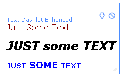
I've created a couple of dashlets which I think are pretty "cool"

Text Dashlet Enchanced:
https://exchange.nagios.org/directory/A ... ed/details
Status Info Dashlet
https://exchange.nagios.org/directory/A ... et/details
Re: Dashboard and Dashlets usage?
Posted: Wed Jul 08, 2015 2:20 am
by WillemDH
See attachment for my home dashboard.
A tip you might not have tried yet => With the custom url dashlet you can add NagVis maps in a dashboard and combine it with Highcharts graphs.
Grtz
Willem
Re: Dashboard and Dashlets usage?
Posted: Wed Jul 08, 2015 9:11 am
by lmiltchev
Thanks for sharing, Willem! Great dashboard!
Re: Dashboard and Dashlets usage?
Posted: Wed Jul 08, 2015 9:58 am
by emartine
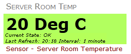
Very nice Willem! Thanks for the tip! This is what I would call a cool dashboard. It is organized, and shows useful info at a glance... exactly what a dashboard should be. I'm experimenting with creating something useful for management... and this is a good step towards that/ See my alert cloud (attached)? Pointless and lame no matter how large I make it!
Yes I know a throw around a lot of words like cool, lame, pointless, useful... but that is because the creation of a dashboard requires an impression to engage interest and relate to the reader otherwise the reader ignores it making its creation pointless.
Re: Dashboard and Dashlets usage?
Posted: Wed Jul 08, 2015 10:27 am
by lmiltchev
Nagios is a very flexible product. You can use a large array of tools. However, you need to use
whatever makes sense for your specific environment...
Obviously, the "Alert Cloud" is not suitable for large installs. The screenshot you posted is a clear proof of it. Here's how "Alert Cloud" looks like on my test box (at least how it looked like at the time of taking the screenshot):
example01.PNG
This is a fairly small install, though.
Having some good examples of pretty and useful dashboards (like Willem's) is a good idea. I totally agree.